
Dragons Fire has a unique-looking dragon design going for it, and for once it’s a Roblox game that includes wyverns! But how good are the designs anatomically?
When I think of a dragon, what I see is a winged reptile with dinosaur aspects, there are many things you can do to make a design unique, but there is a line between what is a dragon and what isn’t for me. In this daily series spanning 5 days I will be looking at dragons in games and judging them on multiple factors, I mean no offence to the developers, I am only stating my opinion on the designs’ anatomical accuracy.
Design
This is another game with anthropomorphic dragons, and I must say, they certainly have expressions, especially the wyvern…
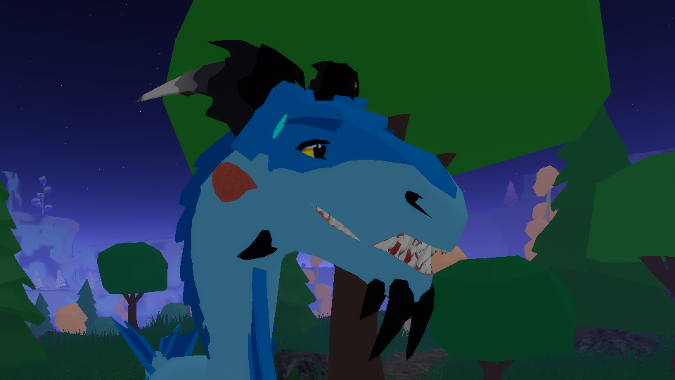
Classic Dragon

Wings
First of all, this design at least doesn’t have “Elbow Finger Syndrome”, however, I think it would have looked better with it because it still has the point in the membrane there (which defies physics).
The wing area is much too small for flight unless it beats them insect pace, and the wings are transparent (like an insect…)? While the wing is bat-structured, it looks like it has paws underneath its wing fingers, and the ends of its wing fingers look kinda strange. These wings are possibly the most inaccurate I’ve seen.
Keel
It’s not the clearest picture, but from what I can see it at least has a tiny keel, far from enough to fly with those wings though.
Body
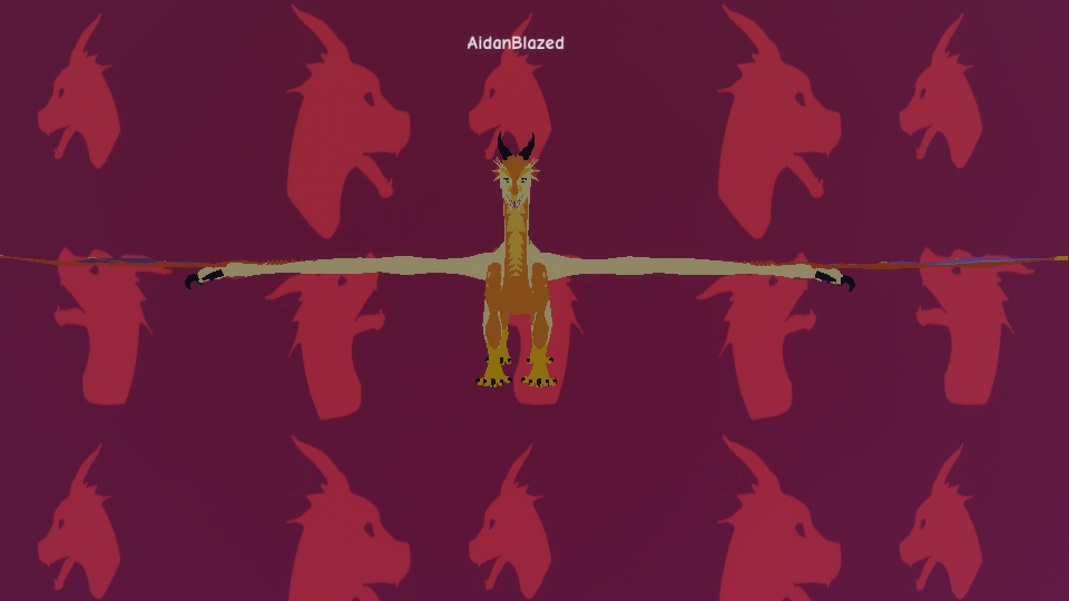
While the wings are beyond inaccurate, the body is great. It has strong enough legs to hold its body up, a long tail and a long but strong enough neck. The head is a bit mammal-like for my interpretation of a dragon.
Overview
This is not an anatomically correct design, especially the wings.
Favourite Feature
I don’t have one.
Despised Feature
The entire wing. Especially the paw under the wing fingers though.
Rating
I rate this one a 3/10, I would rate it a 2/10, but it can at least exist (unlike the NightSnagger from Age of Ashes), so it’s a 3/10.
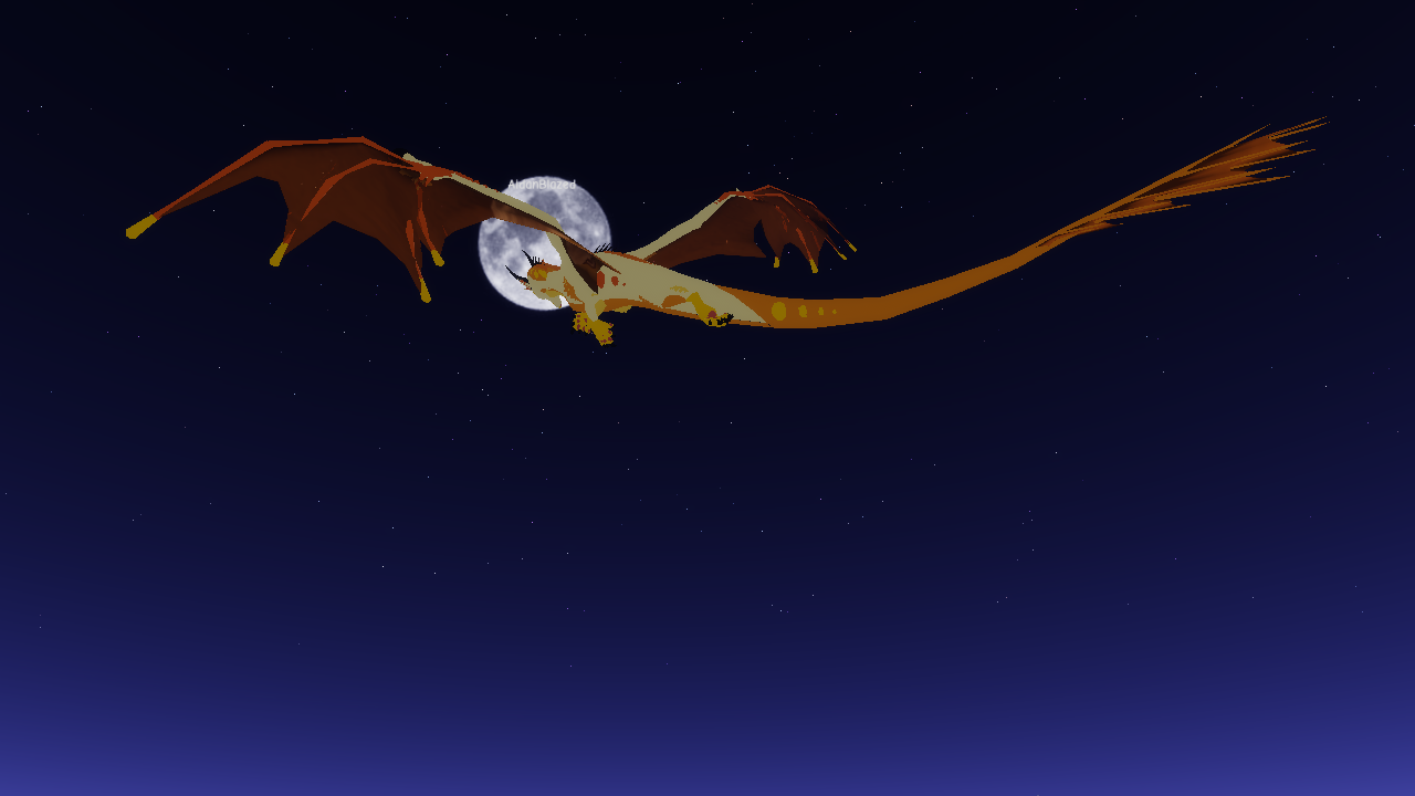
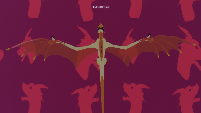
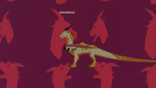
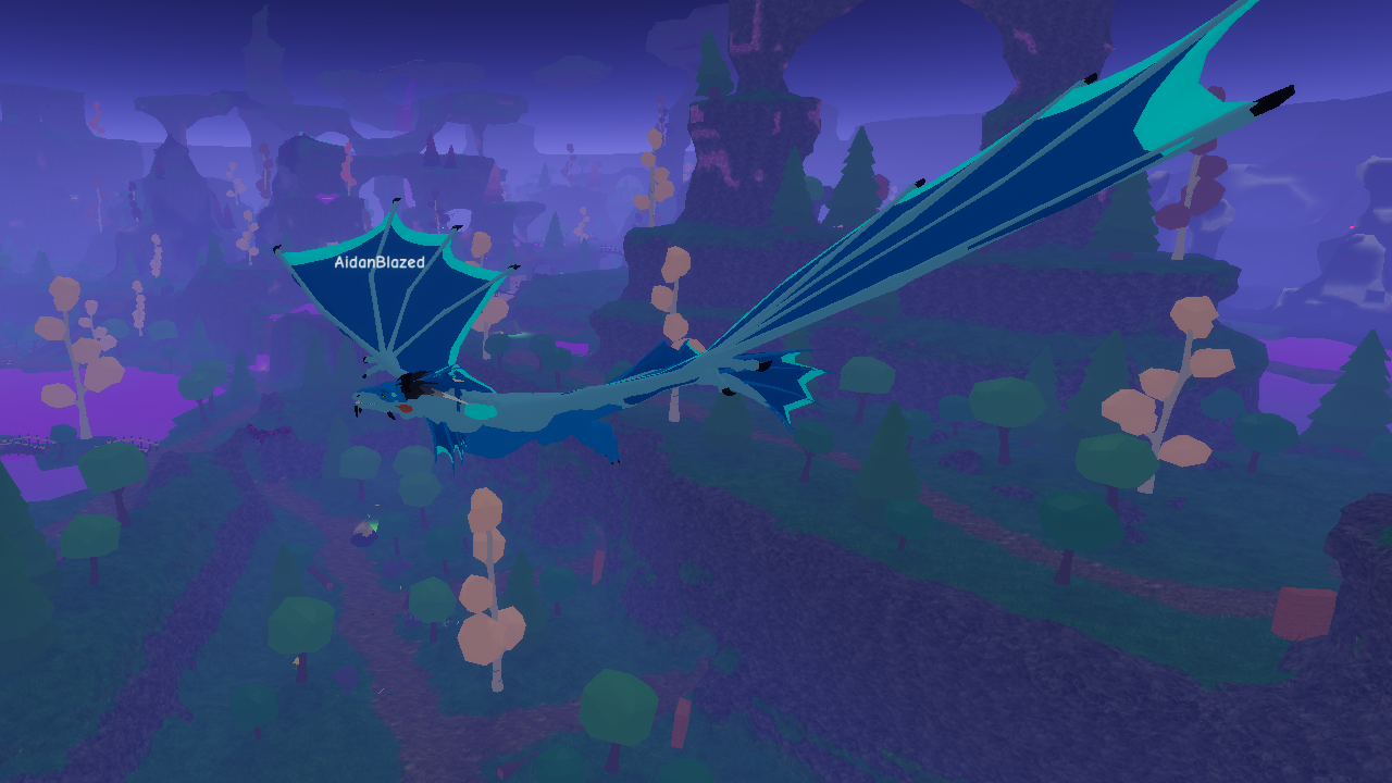
Wyvern

Wings
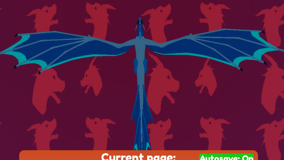
The wings are better on the wyvern than the Classic Dragon, they aren’t transparent, don’t have paws on the underneath and have no “Physic Defying Wing Syndrome”. The wing area still leaves much to be desired.
Keel

The keel looks like it could work if it had a larger wing area. But for the wing area on this design, it needs a much bigger keel.
Body
The legs look weak in this T-pose, but while it is using its wings to walk in addition to its legs it is fine. The body is good, the only thing that isn’t good is that it has mammalian ears and face (its a less mammalian face than the Classic Dragon, which is an improvement, but still a bit too mammalian).
Overview
Better than the last one, but still an average design.
Favourite Feature
The tail webbing.
Despised Feature
The ears…
Rating
This one is a 5/10 because at least it doesn’t have “Elbow Finger Syndrome” like most average designs.
Conclusion
I would like to repeat that I mean no offence to the developers of this game, I may have been a little harsh in this one, but please do not take it that I have anything personal towards them.
The final one of the series is next! Thank you for the support that has been shown for this little exploration of anatomy!
As always, thank you for reading, I hope you enjoyed and to see you again soon :>

(I may have gotten stuck under a bridge while getting the shots for this blog…)
This is the fourth of a series of blogs about dragon design in games, where I will have a look at the accuracy and overall design of the dragons.
Part one: Dragon designs, specifically Century: Age of Ashes
Part two: Dragon designs part 2, specifically Dragons Life on Roblox
Part three: Dragon designs part 3, specifically Monster Hunter World
Part five: Dragon designs part 5, specifically How to Train your Dragon

Leave a comment